
Bedrosians Tile Takeover
- Dec 3, 2020
- 2 min read
We're so exited to share with you some of our favorite Bedrosians products we've used over the years! Take a look below at some of the 'wow' moments we've achieved using everything from classic neutrals to bright pop colors and prints.

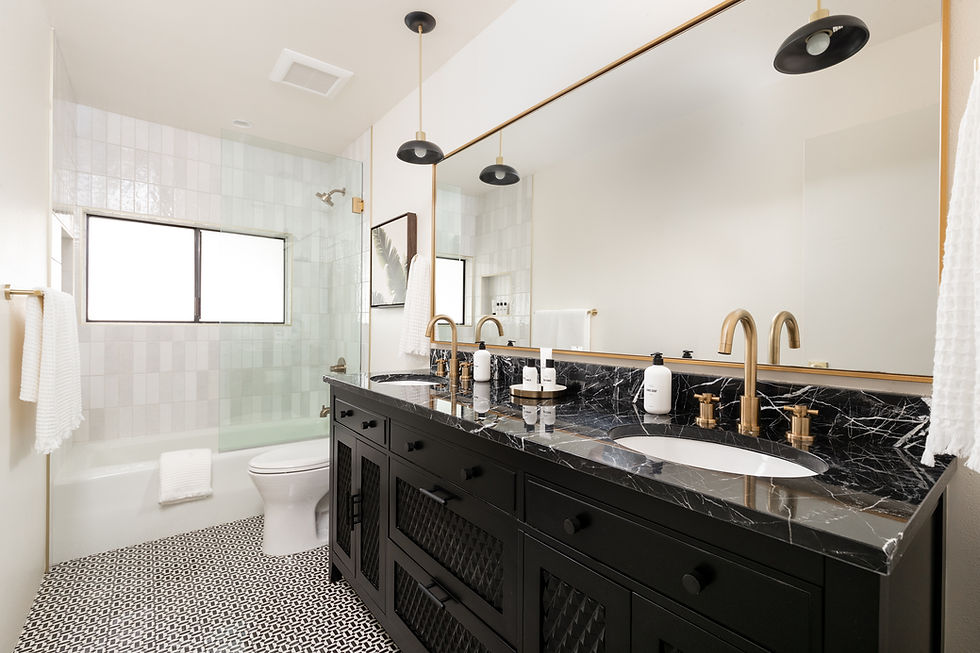
With our Palm House, the modern renovation on a 90yr old palm tree plantation cottage, we wanted to create a modern atmosphere while still tying in the character and personality of the home. So, we used a color palette of bright whites and grey's along with natural wood elements and pops of matte black.

Marble chevron backsplash tiles / Caesar Stone 'Raw Concrete' countertops / Floor tiles in 'Vintage Grey Villa'

Floor tiles in 'Antique Cotto Dynasty' / shower wall tiles in 'Ice White'

Check out more of our Palm House kitchen here, the master suite here, and the living room reveal here!

For our newest project, our 'Fleur House,' we used the 360 penny tiles on both the floor and walls in this bathroom, adding fun, design details with the brighter penny color.
floor tiles / color 'Shale', wall and decorative tiles / color 'Beige', shower drain

This is one of our mood boards for our 'Fleur House' renovation! We used the Cloe in 'White' and a beautiful chevron pattern on the floor, similar to the Bedrosians Yosemite 2x6" tile. We used Waterworks faucets and shower system to elevate the space and tie all the vintage inspired details together.


Here's how we used the Cloe line, this time with their 5x5" tiles, using it as both a wainscot behind the master bathroom soaking tub and for the backsplash in our Centennial House kitchen!


Take a look at our Centennial House renovation here!
With our first 'STAYS' vacation rental we used a lot of color and bold accents, creating a modern, beach vibe. You can find the house here, and for even more images and behind-the-scenes looks, check out our other posts here, here, here and here!

We mixed two bold colors that some people are not a fan of pairing - blacks and blues!
We used both blue and white subway tiles in a vertical stack pattern in a few of the bathrooms, and a bold black and white pattern on one of the bathroom's floors that we instantly fell in love with!
We took that same deep blue color, in a beautiful lantern-inspired pattern, and applied that as a accent wall in small but bold bathroom and tied that back in with the kitchen backsplash. Brass complimented each room throughout the house to create a cohesive, modern look.
Check out the rooms below, we loved how it all turned out!
Wall tiles in 'White' / Floor tiles in 'Loire' / Light fixtures

Wall tile in 'Dark Blue' / Floor Tile in 'Solid White' / Similar mirror in 'Gold' / Light fixture

Backsplash tile in 'Dark Blue' / Countertops in 'Lux White' / Cabinet color is Sherwin Williams 'Dress Blues'
As you can tell, Bedrosians's site has so much versatility in their products and we've loved finding new ways of using their beautiful tiles!
XO -
The HHI Team
PS. This was not a sponsored post!
Comments